Branding
Trans Canada Safety
This case study explores the design process behind Trans Canada Safety’s new visual identity.
The Brief
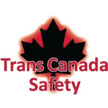
Trans Canada Safety (TCS) needed a logo refresh. Their existing logo wasn’t ideal for large-scale printing and embroidery. More importantly, it didn’t reflect their unique selling points – national reach and client focus. I collaborated with TCS to create a new logo that better embodies their commitment to nationwide service and client satisfaction.
Concept Creation
The maple leaf was a constant as I explored logo concepts for Trans Canada Safety. I then considered highlighting different aspects of their service: overall safety, fire safety specifically, or their nationwide reach.

First Digital Iterations




Font Choice
Sometimes, you stumble upon a font that just clicks with your design. Like a missing puzzle piece slotting into place, it feels like it was always meant to be there. That’s exactly what happened with Eras Bold in this design. The typeface evokes a sense of roads and travel to me, perfectly complementing the overall aesthetic.
Identity Colours
The colour palette for Trans Canada Safety’s new logo was carried over from their previous branding to maintain visual continuity and ensure the updated identity remained instantly recognizable.
Black
TCS Red
Final Logo
The final logo design for Trans Canada Safety reflects the company’s commitment to providing safety equipment across Canada. Featuring a stylized maple leaf and highway, the mark symbolizes national reach. The design maintains strong visual impact while remaining versatile.

In Use
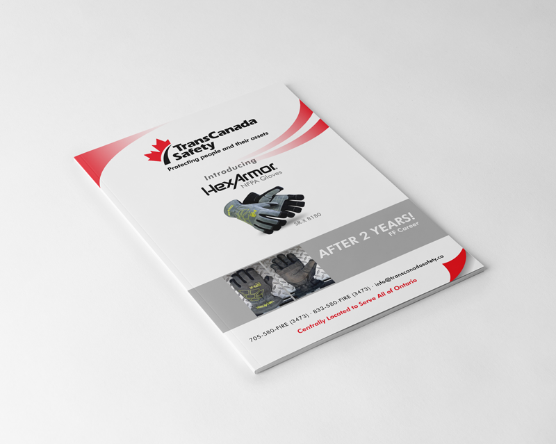
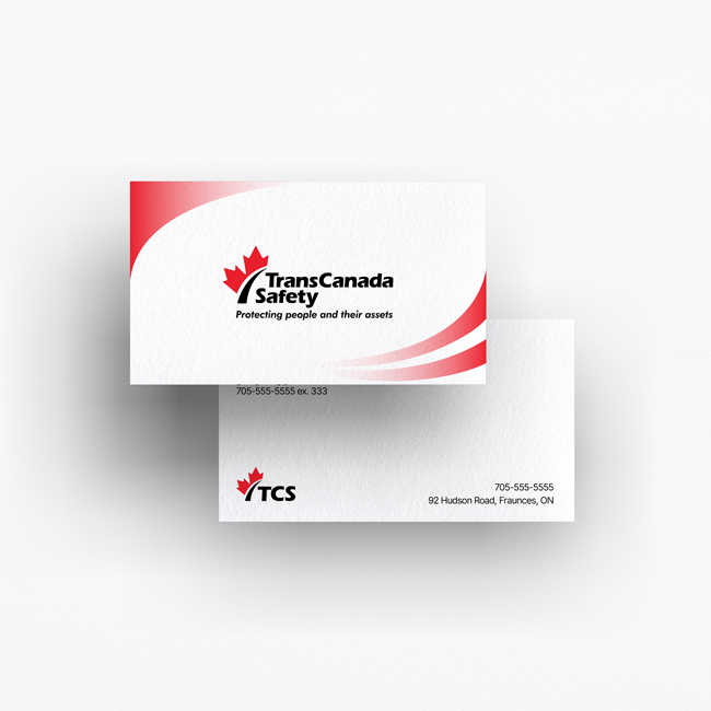
The Trans Canada Safety logo comes to life across various branded materials—including vehicles, apparel, brochures, and business cards. Some shown here are real-world applications, while others are mock-ups that illustrate the logo’s versatility and impact across different formats.
