Visual Identity | Signage | Event Prep
Nordic Minesteel Technologies
This case study explores the design process behind NMT’s new visual identity, signage, and MinExpo booth concept and landing page.
The Brief
In 2023, while working with SMRT Computer Solutions, Nordic Minesteel Technologies (NMT) approached us to assist them with marketing, advertising, and website design. After learning more about their company and goals, we recommended a rebrand to modernize their image and simplify their structure. We created a detailed visual system that unified NMT’s branding with their equipment and products.
Concept Creation
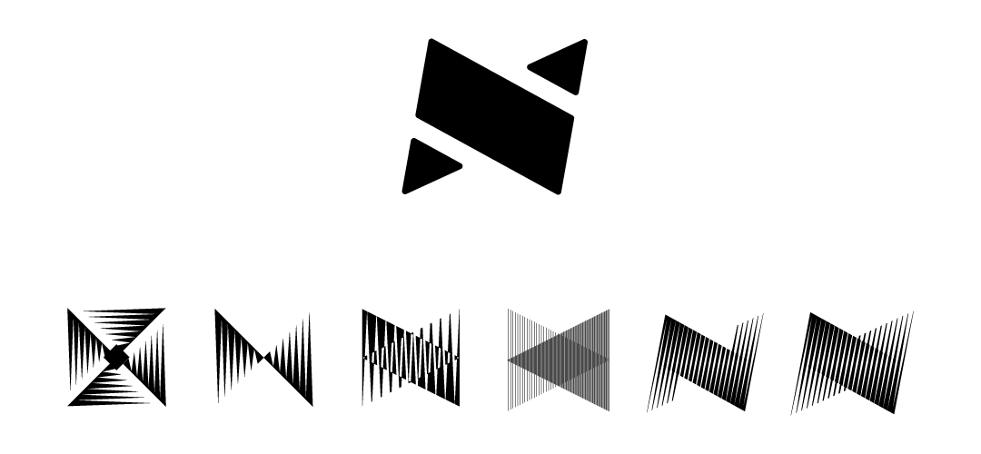
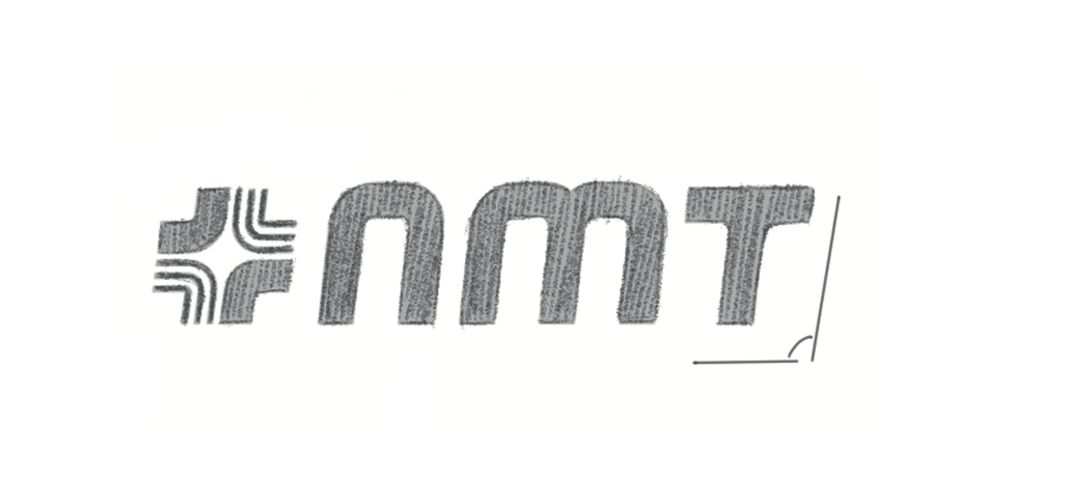
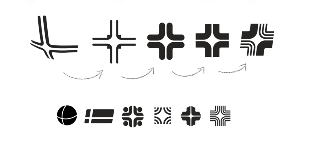
I played a key role in client discovery meetings, uncovering that NMT’s true strength lies in engineering custom machinery, not just selling equipment. To reflect their innovation and growth, we explored multiple design directions before selecting a logo that integrates the “N” and “M” while symbolizing motion and progress. My team and I then built a cohesive branding system, incorporating the logo’s shapes into key design elements, along with a defined font, color palette, and imagery style to create a unified visual identity.


Final Identity
NMT’s final brand identity captures the company’s commitment to innovation, reliability, and growth. The logo, featuring clean typography and a bold geometric mark, serves as the cornerstone of a modern visual system. The color palette, typography, and supporting design elements work together to create a cohesive look that feels professional, approachable, and forward-thinking. Every element of the brand works to create consistency across digital, print, and environmental touchpoints, helping NMT remain memorable in a competitive market.
Designing Impactful Signage for NMT’s New Location
Exterior Branding and a Custom Accent Wall
Pylon Sign
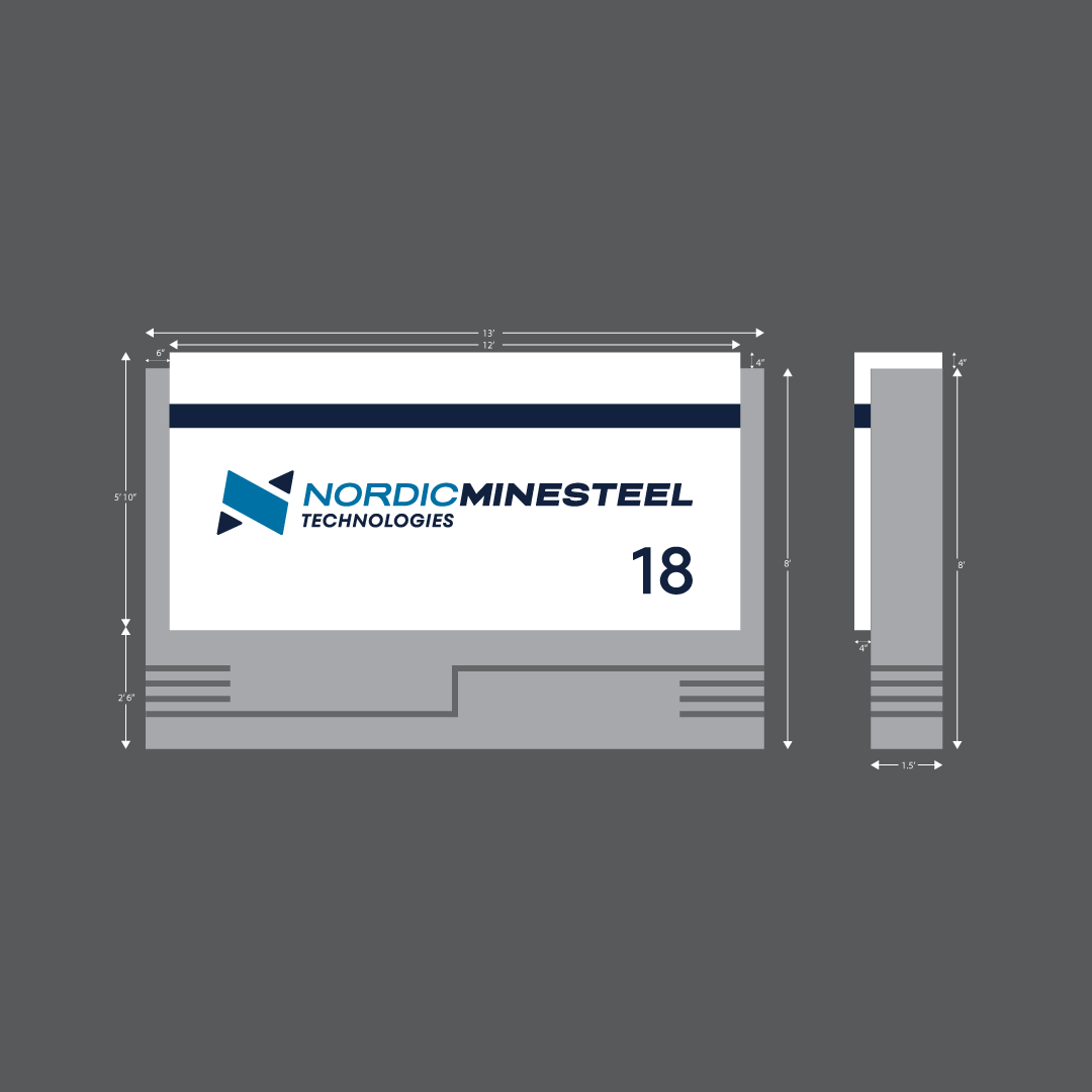
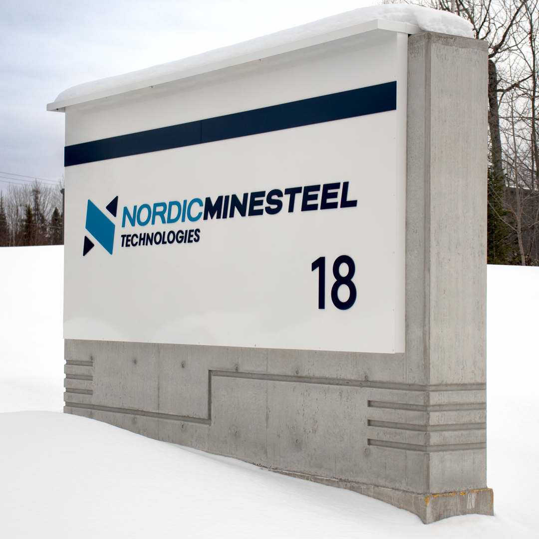
I wanted NMT’s pylon sign to stand out while embodying the forward-thinking nature of their organization and industry. To achieve this, we incorporated cement into the design—balancing the rough, industrial essence of their business with clean lines and lit laser cut vinyl. The result is a distinctive sign that effectively represents NMT’s innovative spirit and industry expertise.
Channel Letters
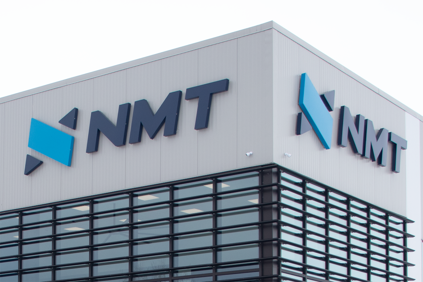
While the use of NMT’s abbreviated logo is straightforward, the dimensional channel lettering makes a bold statement through its clean lines, generous scale, and strong contrast against the building façade. At night, halo lighting adds a glow, enhancing visibility and giving the signage a striking presence after dark.
Accent Wall
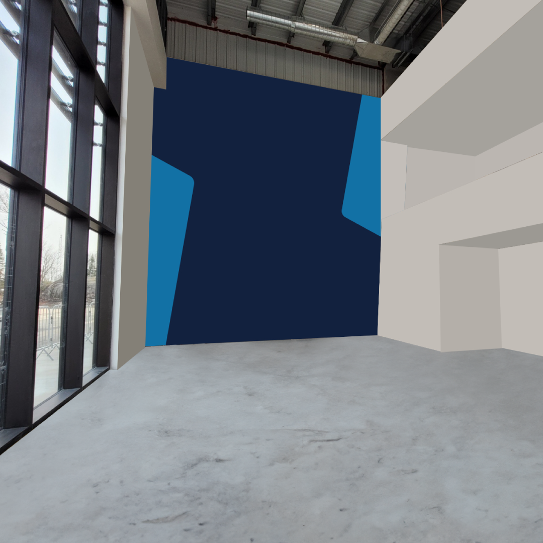
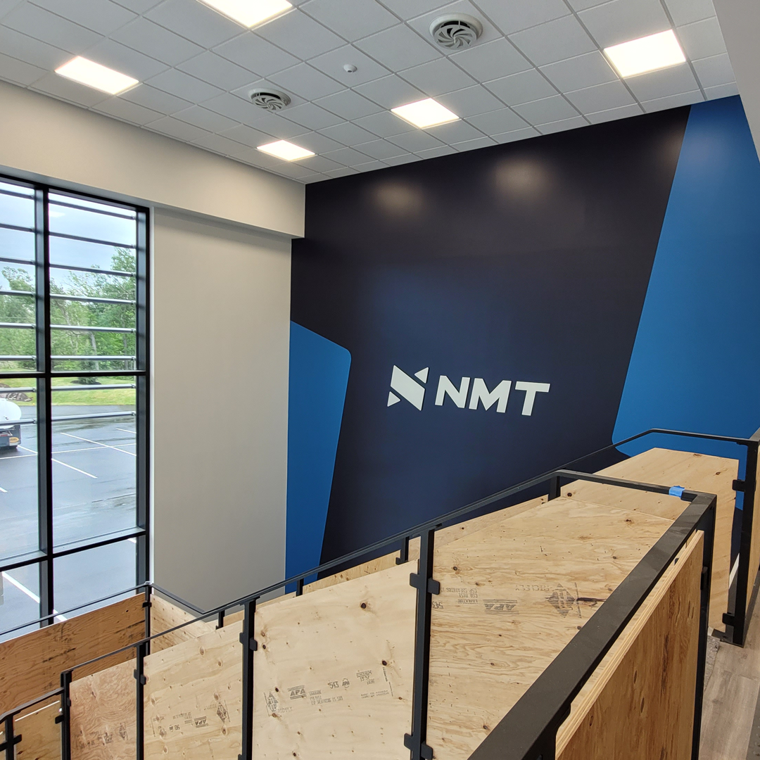
Collaborating closely with NMT’s signage producer, we developed a design that combined a painted wall mural with laser-cut signage featuring their logo, resulting in a striking and cohesive visual element.
Showcasing Innovation at MinExpo 2024
Booth Design and Landing Page for NMT
MinExpo | Booth Concept
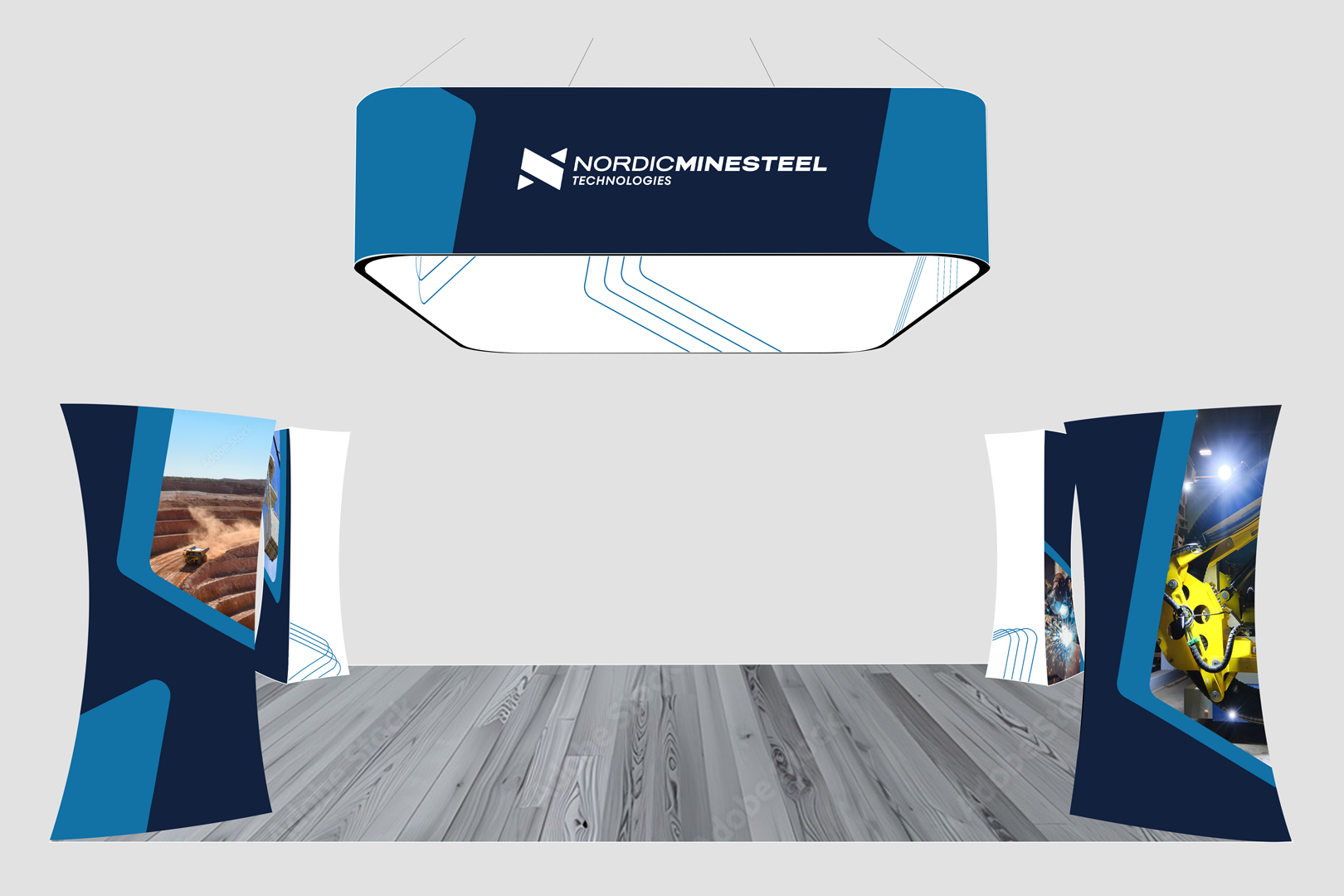
In 2024, NMT participated in MinExpo, and I had the exciting opportunity to develop concept designs for their exhibition booth. My work included designing hanging signage, branded pillars, and optimizing the furniture layout to enhance both functionality and visual appeal. The goal was to create an engaging and cohesive space that effectively showcased NMT’s brand and capabilities while ensuring a welcoming and professional environment for attendees.

MinExpo | Landing Page
I created a dedicated MinExpo landing page for NMT’s website. This page provided essential information for visitors, including details on how to locate NMT’s booth, an overview of what they would be presenting, and key highlights of their innovative solutions. The landing page aimed to generate excitement and served as an informational touchpoint for clients visiting from social media or the MinExpo website.

