Case Study
Crazy Mema’s Diner
This case study explores the design process behind Trans Canada Safety’s new visual identity.
Branding

01.
The Brief
Trans Canada Safety (TCS) needed a logo refresh. Their existing logo wasn’t ideal for large-scale printing and embroidery. More importantly, it didn’t reflect their unique selling points – national reach and client focus. I collaborated with TCS to create a new logo that better embodies their commitment to nationwide service and client satisfaction.
02.
Concept Creation
The maple leaf was a constant as I explored logo concepts for Trans Canada Safety. I then considered highlighting different aspects of their service: overall safety, fire safety specifically, or their nationwide reach.
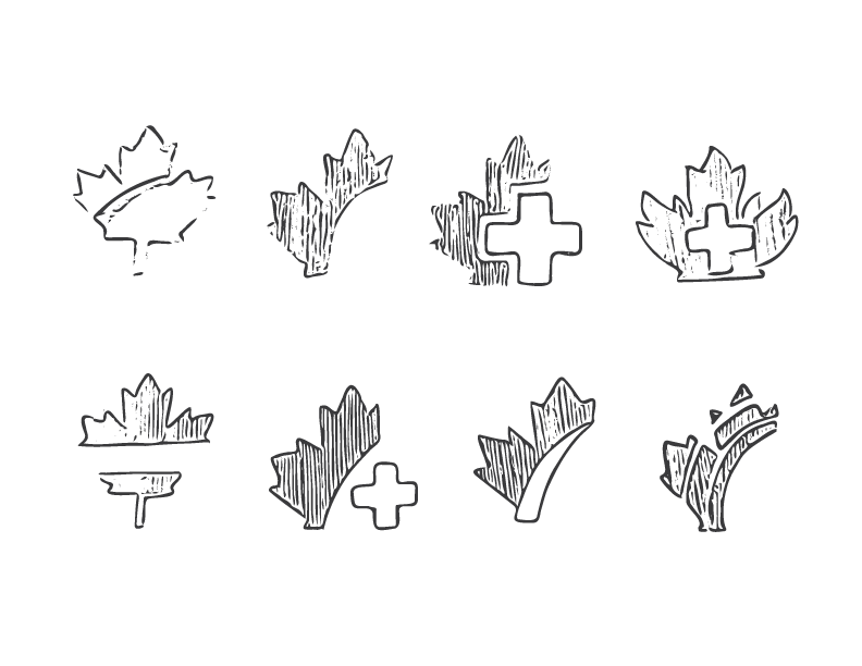
First Digital Iterations




Font Choice
Sometimes, you stumble upon a font that just clicks with your design. Like a missing puzzle piece slotting into place, it feels like it was always meant to be there. That’s exactly what happened with Eras Bold in this design. The typeface evokes a sense of roads and travel to me, perfectly complementing the overall aesthetic.
Identity Colours
Sometimes, you stumble upon a font that just clicks with your design. Like a missing puzzle piece slotting into place, it feels like it was always meant to be there. That’s exactly what happened with Eras Bold in this design. The typeface evokes a sense of roads and travel to me, perfectly complementing the overall aesthetic.
Black
#FFFFFF
TCS Red
#EE212E
03.
Final Logo
Lorem ipsum dolor sit amet, consectetur adipiscing elit. Maecenas porta urna eget massa auctor, vitae maximus nulla tempus.

04.
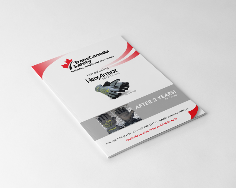
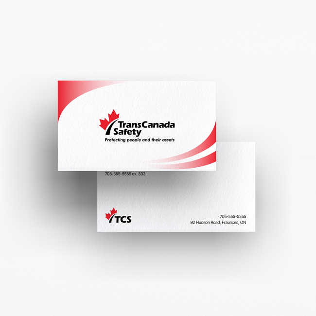
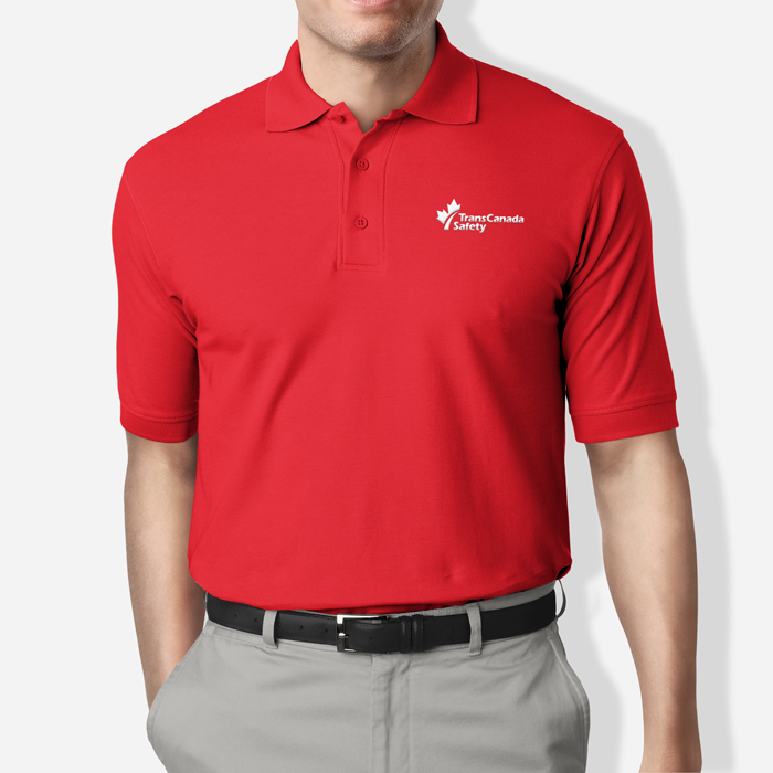
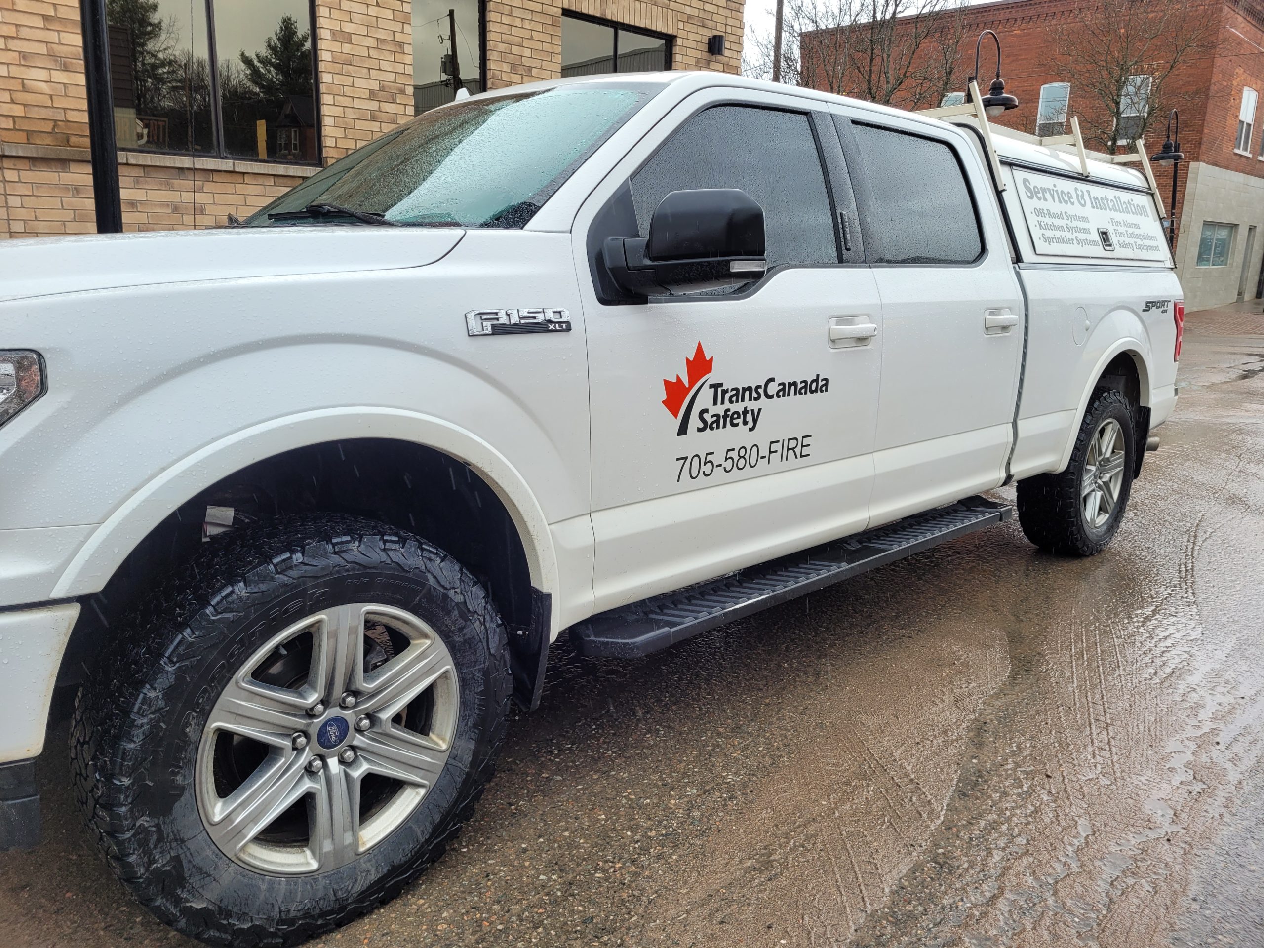
In Use
Description
Portfolio
Related Work

Pregnancy Care Illustrations

